![[Home page]](PythonPowered.gif "Home page")
| Books | Code | Blog | Python | Author | Train | Find | ©M.Lutz |
This desktop- and mobile-friendly website has been live since the mid 1990s. It hosts hundreds of pages spanning software-related topics including programming, technical education, and industry trends, and all of its code and content has always been both free and advertising free. This site has also always been more about substance than style; while it does keep pace with web fashion, its main focus is on providing tech material for tech readers.
This site works as you'd expect, but here are a few quick tips. All of this site's content can be reached from its bottom-of-screen toolbar and Find page. Scroll or swipe the toolbar on smaller screens to access all its links (tap first to activate where required); its leftmost image jumps to this site's home page. Larger pages, like this one, also have floating Top buttons that jump to page top or content lists, and some have dynamic table-of-contents widgets that toggle TOCs. As of 2025, more pages also now follow your device's dark-mode setting.
Neither specific browsers nor JavaScript are required here, but some features work best (or only) if the latter is enabled—including Top, content widgets, and this site's many image galleries (more demos). Most content here renders equally well on mobile and desktop browsers, though at three decades and counting, you shouldn't be surprised if some of this site's more ancient pages are still desktop biased or otherwise retro. Older content may also harbor a few grammar speed bumps; like coding, writing improves with practice and time.
The rest of this page covers:
Related pages: see also this site's privacy statement and the story of this site's original home at rmi.net/~lutz.
This section logs changes and site-usage tips that have cropped up in recent years:
In its version 135, Android Chrome (AC) has begun adopting Android 15's edge-to-edge app-display changes. In AC, this means overlaying the Android navigation toolbar on top of content fixed to page bottom—rendering such content unusable. This includes the toolbar used at the bottom of nearly every page on this website (there's one lurking below). No other Android browser does this today, though Edge similarly but temporarily imperiled toolbars long ago.
So far, the AC flavor of this breaking change applies only to:
Further, this change impacts only pages with:
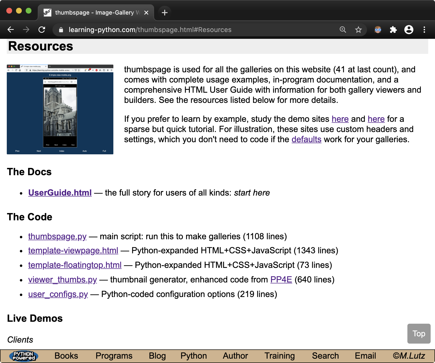
The combination of these requirements makes this change's impact modest today. As an example, image galleries built by the thumbspage program are immune because their default index footers have ample free space at page bottom, their custom index footers are builders' responsibility, and their viewer pages don't scroll (and their nested note-text widgets don't count).
Moreover, the first three requirements above narrow this change's device scope. Indeed, it's been difficult to create its effects in testing. A Fold 7's cover screen, for example, triggers overlays only sporadically, and other tested devices don't exhibit them at all. When testing is lucky enough to make them happen, here's the scene on the Fold 7 before a down scroll and after.
Even when the overlay does occur, users can simply scroll up slightly to make the navigation-bar chin retract again, thereby uncovering page-bottom content. This is a minor inconvenience and no worse than jumping to a top-of-page hamburger menu (which may fall victim to edge-to-edge dogma too). Users can also simply use a different browser—and perhaps should, given the perennial breakages in AC.
Nevertheless, user upgrades to Android 15+ are inevitable, and it's reasonable to assume that this change will be expanded to both larger navigation buttons and larger devices soon. Given that this mod will break a multitude of websites, its long-term prospects may seem sketchy. Given the track records of both Android and Chrome on such things, however, it seems prudent to expect the worst.
More pressingly, Chrome has a dominant 67% market share on mobile devices today per both statcounter and statista, and most of those people aren't going to install a different browser just to visit your site. For better or worse, AC's quirks are significant.
So what to do? Short of a full website redesign to concede entire portions of web pages to browsers, AC docs propose a variety of CSS approaches for handling the overlays. One leaves content visible beneath toolbars, which is obviously subpar. Another uses iffy constants and code that attempt to pad the toolbar for the chin's slide—but failed altogether in testing. See the fails here and here.
Instead, the fix at this site uses code proposed by AC docs that's an effective opt-out for the change. Here's the required change from this site's main CSS file (only its last setting is new):
.footerdiv {
    position: fixed;
    bottom: 0;
    padding-bottom: env(safe-area-inset-bottom, 0px);   /* effectively an opt-out */
}
Per AC docs, this code is not recommended for performance reasons—and so much so that AC avoids sliding the navigation bar into content when it detects this pattern. In other words, using this "forbidden" code simply turns the edge-to-edge nonsense off altogether... which is ideal! Changes that are both breaking and mandatory are rude to both site users and site developers. In this case, at least, Chrome itself provides a loophole.
For more info, and to judge all this for yourself, you can read about the AC overlays change here and its Android 15 edge-to-edge basis here and here.
Caveats: the fix used here has not yet been applied to some program docs on this site; scroll up slightly as needed until this is globally adopted. It's also possible that this fix may either become unnecessary or have to be tweaked in the future if (well, when) AC changes yet again. Alas, chasing Android and browser churn seems a full-time job.
Related: see this note for a thumbspage-galleries workaround to AC's pull-to-refresh breakage that also cropped up around the time of version 135. Engineering durable content upon a constantly thrashing base like Android Chrome is difficult to impossible. When did this field forget that?
chrome://flags per
ahead). Going narrower minimizes the need for
toolbar scrolls of either variety, and is a low-impact work-around for overlays.
This is a Windows+Chrome issue only; macOS, Linux, and Android and iOS mobiles do scrollbars better, and Firefox and Edge do them better on Windows. This also smacks of the old Edge URL-overlay bug chronicled here, but Google seems unlikely to provide a fix given their track record and dominance. In fact, this might be dismissed as a single-browser quirk, but for the mind-boggling hold Windows and Chrome have on the PC realm (though Android rules overall, and stats can be gray).
At this writing, Chrome may adopt a new and less obtrusive scrollbar-overlay model pioneered by Edge which would make overlays safe; see the web for more info. But as is, Chrome's Windows default in late 2022 is still scrollbar gutters (which feels like it's 1995), and its overlay scrollbars now break content (which feels rude). Where did browsers get the idea that page space is theirs for the taking?
Going narrower involved both shorter link words and a lower min-width
for the scroll cutoff. On PCs, the new min-width doesn't have any effect
on typical
windows,
and ensures that a toolbar scrollbar of any sort will be required
only when windows become unusually narrow, or fonts or zoom become unusually large.
That is, this makes scrollbars moot except in windows that are atypical for a PC;
here's the new
cutoff
on a small 13" display at 100% zoom.
On mobiles, going lower simply preserves former
layout,
despite space freed by the shorter words. Test for yourself, or find
more images here.
All of which may seem a trivial mod, but the alternative is a floating-menubutton redesign, which seems overkill for what's really yet another browser bug. This bug should probably be reported, of course, but this developer has grown overly tired of seeing bug reports languish—and eventually get closed with a "by design" quip. Such is the software field in the 2020s, eh?
Update, Oct-2022: after scouring the web's development forums (really, gossip mills, because that's often all there is to go on sans usable vendor documentation), it turns out that an obscure and browser-specific bit of CSS can hide the overlay-scrollbars bar in most browser/platform combinations:
.footerdiv::-webkit-scrollbar {
  display: none;                 /* Chrome, Safari, Opera, etc. */
}

.footerdiv {
  -ms-overflow-style: none;      /* IE, old Edge */
  scrollbar-width: none;         /* Firefox */
}
With that Tower-of-Babel hack, Windows Chrome's disabling
overlay
indeed goes away in bottom-of-page toolbars, but toolbar scrolling
still works when needed (per the original overflow-x: auto). Here's the
scene.
The same thing happens in all of the seventeen desktop and mobile browsers tested
across five platforms, though other browsers don't make overlaid content inoperative
the way that Windows Chrome does today.
The downside—and there usually is one for ad-hoc proprietary extensions like this—is that this leaves people in the dark if they have no way to perform a left/right sideways scroll. This might arise if there is no touch screen or gesture-capable touch pad, and the pointing device is unable to issue a sideways scroll. Though likely rare today, mice with neither scroll wheels nor touch surfaces would fall into this category.
To compound this, detecting such limited devices seems a pipe dream;
a pointer: fine media query won't
cut it.
Perhaps worse, if overlay scrollbars are disabled (Chrome's current default),
the code above prevents a scrollbar
gutter
from appearing for the toolbar. Here's the
effect;
the same goes for macOS if scrollbars are set to Always in General Preferences.
Sideways scrolls still work on the toolbar in this state where available,
but this rules out disabling overlays as a solution for sideways-challenged
pointers: there's nothing to grab onto!
That being said, the scope of this tradeoff may be small:
Because the audience impacted by the code above is likely smaller than that crippled by Chrome's overlays, and because toolbar scrolls are relatively rare in any event, this code has been adopted as a temporary measure for footer toolbars only, pending better overlay scrollbars in Windows Chrome. If this makes toolbars unscrollable for you, please see the list above for recourses, or simply expand the window till scrolling isn't needed—a fallback made easier by the original mod here to narrow toolbars in general.
And for now, all bets on whether a Chrome fix shows up before a site redesign are officially off...
/etc/passwd file; the fetch was useless because the file by
convention simply forwards to another that's not accessible, but it was
sufficiently creepy to warrant the fix. Alas, the world wide web means everyone,
for better and worse. Read the seedy details at header "DON'T DISPLAY
FILES OUTSIDE THE WEBSITE FOLDER" in
the script,
and see the new reply from
the query.
Update, Nov-2021: the book-links page has now gone dark too, and both that and the home page now always use the dark barkground regardless of system settings. Designing for both light and dark is complex, and dark is not that dark here. The home page now also uses rounded corners and collapses its links on narrower displays; web fashion marches on.
Update, Dec-2021: image galleries at this site, all of which are created by thumbspage, now also are darker, with a new default index-page color. It's not OLED dark, but that's easy to config.
Update, Sep-2024: a few years on, limited portions of this site now
use CSS media queries for prefers-color-scheme to select a color
theme based on the host device's dark-mode setting. See examples
here and
here.
This works well today, but is a bit of a jarring contrast with all the
former pages not designed for dark mode, either because it wasn't yet
well supported in CSS, or simply didn't yet exist. Change convolutes things.
Update, Mar-2025: full dark mode is now starting to roll out to more pages on this site, including its home page, book indexes, other top-level pages, and newer image galleries. The basic CSS behind this is simple:
BODY {
    color: black;                    /* light mode defaults */
    background: cornsilk;
}
@media (prefers-color-scheme: dark) {
    BODY {
      color: #e0e0e0;
      background: #121212;           /* text: off-white on off-black */
    }
    IMG {
        filter: brightness(85%);     /* darken bright elements near text */
    }
}
But configuring pleasing color themes in both modes remains a subjective and
ongoing challenge. Toggle your device's setting to change web-page appearance
as desired; light mode generally renders prior color themes.
Scroll to hide toolbar is toggled on; and can be triggered by
scrolling to hide the browser's toolbar and then changing device orientation.
The GUI seems to believe a phantom browser toolbar is still present at page bottom
(and in some cases, renders an empty strip for it). To work around, either set
the toggle off, or use any other Android browser until this is fixed (which may
be soon, given the flurry of reports:
here,
more).
With the toggle-off fix, pages look like
this and
this,
but some naturally lose space in the bargain.
Update, Mar-2022:
regrettably, this Android Firefox bug remains unfixed as of version 98,
and its report posted by this site was
closed
as stale without developer attention.
In versions 95 through 98, the bug may have also morphed—after a scroll
hides the toolbar, the bug can still be triggered by rotating orientation,
but also by simply moving a stylus over widgets with hover actions. Here's the
before and
after of the latter.
The only work-around remains toggling Scroll to hide toolbar in
Customize off.
Hey Firefox: your dynamic toolbar is still busted a year later; doesn't anyone care?
Update, Oct-2022:
if you use the latest Firefox on Android (105.1 at this writing), you'll
probably also want to turn off its Swipe toolbar sideways to switch tabs
in Settings => Customize. Else, it's nearly impossible to operate this
site's footer toolbar with a finger, because Firefox steals most swipes near
the bottom of the screen—even if they are well above the browser's own
toolbar. A stylus helps by providing more touch accuracy, but not everyone has
one. Alas, this site's pages seem to keep running afoul of browser
land grabs!
Update, Oct-2022: and if you use Firefox on Linux (only), you may notice that its versions 105 and 106 cover toolbar items with URL mouse-hover popups—just like Edge once did in the now-distant past. There is no work-around for this, and a bug fix seems fanciful given all of the above; see other browsers.
/* bug
/* in a <pre> block
(and elsewhere); it was noted in version 53, but happily fixed by 60.
Things get better too.
Update, Jan-2022:
unfortunately, this Android Opera bug returned a few releases later, by
version 65. The work-around at this site required both a custom parsing
script, and manual replacement of all
/* with /* in three of eleven
pages having this pattern here—including
this and
this.
Alas, Opera appears to be performing some sort of naive page parsing—and
appears to have discovered it anew. One person's "agile" is
another's "reckless thrashing."
aA menu's
page-zoom option in iOS 13
Safari.
This impacts a handful of pages on this site—including its
home page.
For such pages, the new Safari option is not a font zoom; it's really a
screen zoom that works like a pinch/spread with fixed stops.
Specifically, this site's home page fits well in portrait mode up to 125% page zoom on the latest iPhone SE's 4.7" display, but only up to 100% on a 4" iPod. At higher zooms, your best options are a minor scroll where required; rotating to landscape for fit-to-screen viewing; or simply lowering your page-zoom level. Page redesigns or browser changes may address this someday, but the work-arounds are easy, screen zooms are tough to accommodate in full, and minuscule displays will never be ideal for text-heavy websites.
It's worth adding that this issue—arguably an iOS Safari bug—does not occur in Android Chrome at any practical font or screen zoom. Here's this Chrome's normal and zoomed display; unlike Safari, fonts are increased without overflowing the viewport. Though no vendor is flux free, Apple's track record of breaking sites and programs with opinion-based morph is much too large an insert for this note.
Update, Oct-2022: this site's homepage now works without full-page horizontal scrolls on a 4" iPod up to 115% zoom in Safari, after its buttons shaved 10 pixels each for unrelated aesthetics. It's not pretty and 100% is still better, but this is probably a worst-case device for web views (with an audience size to match).
aA menu
option
in iOS 13.
Without this setting, this site's bottom-of-page toolbar buttons must be
tapped
twice:
once to restore Safari's toolbar, and again to activate the button.
With the new setting, this site's page toolbars work
perfectly in iOS Safari,
and as they do in all other browsers today. As a bonus, the new setting
also fixes landscape
views
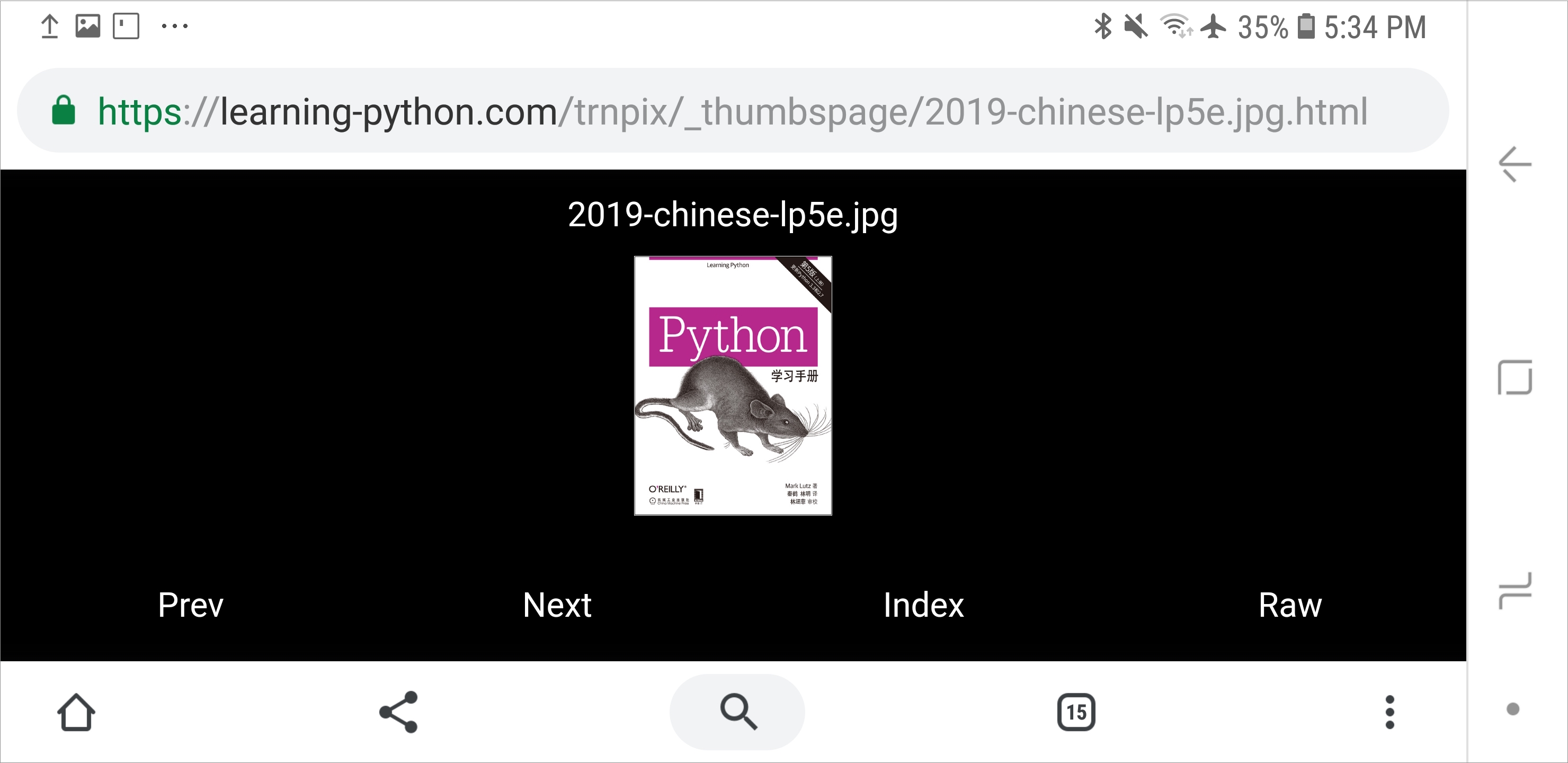
of thumbspage image galleries.
(See also the related and later note above)
Subtle thing: the preceding note's new Top buttons may slightly overlap page-bottom toolbars like this when viewed with most desktop browsers in very small and narrow PC windows, because these browsers reserve extra space for a scrollbar. This can happen on Windows, Linux, and macOS, though not on macOS when using a touchpad and the General preferences' automatic scrollbar-hiding default (which acts much like a mobile device).
This behavior is also intentional: it allows more space for content in this atypical and cramped context, and can be avoided by simply enlarging your PC browser window. Moreover, always moving Top up would penalize normal cases by obscuring more content; positioning Top based on screen width would require JavaScript and may be inaccurate; and portable toolbar-less designs would require JavaScript for basic site usage—an explicit anti-goal here (that is, until this rule was later relaxed in the name of functionality).
Update—minimizing scrollbars in Chrome: but if you really want your Top to fly free, at least for Chrome on Windows and Linux (where it's a.k.a. Chromium), it's possible to hide scrollbars and keep Top above toolbars, by setting a special flag like this:
chrome://flags in Chrome's top-of-window address box;
Overlay Scrollbars in the result page's search box;
Enabled in the result page's pulldown list; and
Relaunch to restart Chrome and apply the change.
Update, Mar-2022—ditto for Firefox and Edge: with the advent of overlay scrollbars on Windows 11, both Firefox and Edge now also support minimal scrollbars, which roughly mimic macOS and mobile, don't take up as much UI space, and react to swipe gestures on touch pads and screens. Enable this in the latest versions of these browsers as follows:
edge://flags in the URL box,
search for overlay scrollbars, enable, and relaunch.
about:config in the URL box,
search for win11.scrollbar, and enable. Confusingly,
you can also set scrollbar.style of
widget.non-native-theme to 1, 2, or 3 to make
scrollbars narrower if desired.
In the plus column, this site's toolbar also shrunk recently, rendering PC scrollbars less common (and even rare) overall, and you can still simply resize your window to avoid this scrollbar circus in full.
chrome://flags in the address bar,
search for Chrome Duet in the result, select Disabled
in the entry, and restart Chrome. See the Nov-2019 scrollbar tip
above
for a screenshot of Chrome's flags interface.
This setting isn't strictly required for this site, but content should never take a back seat to browsers—as in this Chrome Duet scene, where browser controls take up almost as much space as the page. Down in front, Chrome!
This site grew up with and marginally prefers to be viewed on desktop browsers. It has been verified to render well on all desktop browsers in common use today—including Chrome, Firefox, Safari, Opera, Internet Explorer, and Edge. Per the updates above, a desktop-only caveat regarding toolbar overlays on URL hovers in Edge and Firefox was initially addressed by redesign, and later made moot by fixes in these browsers.
This site can also be read on and has been optimized specifically for mobile browsers—including Chrome, Safari, Firefox, and Opera. Although nearly all content here is now mobile friendly, some pages may still be best viewed in landscape mode, due to this site's wealth of text-oriented material (see also the Safari notes above). There's more on mobile-browser usage ahead.
In terms of tech and design, this site uses:
Some of the above is orchestrated by the site's .htaccess and CSS files. JavaScript is also used, but is optional, and run only for anonymous analytics, photo viewers, and in-page navigation if enabled (to see how, view the source of this page, an image viewer, or a page with navigation controls). Mobile-device support employs additional HTML and CSS techniques, per the next section.
This site is readable on all mobile browsers, and as of February 2018 has been heavily tuned to support smaller screens specifically. Mobile viewport settings alone worsened as many aspects as they improved, but usability issues were fixed with extra design changes, including:
That said, despite the redesign, a few parts of this site are still less than ideal on mobile devices, and others may never be optimized for mobile use. Code listings, for example, may require swipes to view in full; the class workbook is legacy desktop content generated by Word that cannot be easily changed; and the HTML user guides and screenshot galleries of desktop-only programs here have been converted, but for online use only.
In addition, given the volume of content here—most of which is text based and some of which dates back to the mid-1990s—landscape orientation may work better for some pages on smaller screens. Naturally, performance and preference may vary per device, browser, and user, and some browsers have reading-mode converters and text-scaling settings that may further improve user experience.
Like them or not, smaller screens are convenient but inherently limited; the goal here is to accommodate by enhanced style, not to pander by reduced substance. This site's traffic is currently 70–75% desktop browsers (depending on when it's checked), and its main reason for being is to support readers of books and learners of code. If you're not interested in reading words, well, how did you ever get this far?...